
Client: Hare & Tortoise Running
A brand refresh
Hare & Tortoise started as a tiny running club in 2017 but over the years have grown a pretty large following of runners who enjoy the confidence they feel coming to Hare & Tortoise running events rather than other races.
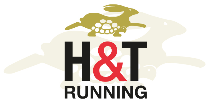
The initial Hare & Tortoise logo was the result of a sketch that the owner created when they first decided on the name. Now that Hare & Tortoise have established their reputation and their name is widely known locally, the owners thought it was time to refresh their brand.
They wanted to introduce the concept of the shortened version of their name: H&T Running. They also wanted a simplified version of their original logo.
Handstand developed a contemporary and streamlined version of the Hare & Tortoise logo as well as creating a fresh, new look for H&T Running.
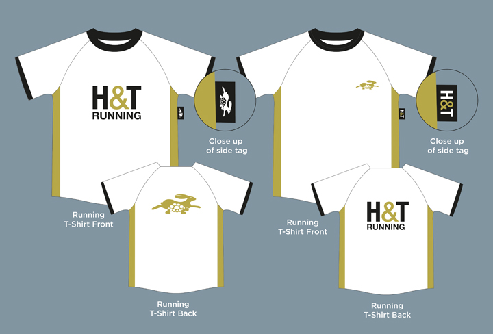
We are looking forward to seeing the club’s new T Shirts!